Response to PowerPoint Does Rocket Science
How to make engineers write concisely with sentences? By combining journalism with the
technical report format. In a newspaper article, the paragraphs are ordered by importance,
so that the reader can stop reading the article at whatever point they lose interest,
knowing that the part they have read was more important than the part left unread.
State your message in one sentence. That is your title. Write one paragraph justifying the
message. That is your abstract. Circle each phrase in the abstract that needs clarification
or more context. Write a paragraph or two for each such phrase. That is the body of your
report. Identify each sentence in the body that needs clarification and write a paragraph or
two in the appendix. Include your contact information for readers who require further
detail.
-- William A. Wood (email), September 8, 2005
Response to PowerPoint Does Rocket Science
This doesn't exactly fit `rocket science' but I was not sure where else to put it. A better title might be "Power Point does lifesaving--NOT."This was an entry at the National Review blog called The Corner at 1:22 p.m. September 8 [http://corner.nationalreview.com/].
If you want to see low levels of useful data per slide, let alone irrelevance to the task at hand [presumably saving lives threatened by Katrina], you could hardly beat those referred to below.
"On lunch at work, but still would prefer no identification if referenced. Thought you might like to experience what our elite fire and hazmat volunteers are going through. This is insane.
"It appears that all people under FEMA for over two weeks must take "awareness and prevention of sexual harassment," "equal rights officer orientation," and "valuing diversity" training programs. The programs total 3-4 hours.
"The mandatory training matrix is here: http://training.fema.gov/EMIWeb/downloads/Mandatory05Matrix.doc
"The letter adopting the matrix is here: http://training.fema.gov/EMIWeb/downloads/Mandatory%20TrainingII.doc
"Powerpoints for the trainings:
http://www.training.fema.gov/emiweb/downloads/DF506/DF%20506%20Sexual%20Harassment%20Visuals.PPT
http://www.training.fema.gov/emiweb/downloads/Df434/DF%20434%20Intro%20to%20Equal%20Rights%20Powerpoints.ppt
http://www.training.fema.gov/emiweb/downloads/DF416/DF%20416%20Diversity.ppt
-- John Liljegren (email), September 8, 2005
Response to PowerPoint Does Rocket Science
I wasn't surprised to see my remark about Nature and Science contested but I was surprised to see who did the contesting, because what I see as the faults of these journals are exactly the sort of faults that you often criticize in your books. They both publish a lot of work that is fashionable and apparently exciting, but they don't insist on including the supporting information that allows readers to know exactly how the experiments were done -- half the time they wouldn't even allow authors to include this information because they would say it made the article too long. What happens in practice, therefore, is that high-profile authors will publish a claim-staking exercise in Nature or Science and then, if you are lucky, follow it up later in a journal of lower prestige with a "full paper" that includes the essential details omitted the first time round.
Let me quote (in suitably anonymized form) an e-mail that I received last week from a distinguished colleague in the US:
Thank you for bringing the (journal) paper by (authors) to my attention. I have not been keeping up on the literature (relevant comments below) and was not aware of it but absolutely agree with it. The paper by (other authors) (Nature, 2003) is pure bullshit, and the editors and reviewers responsible for letting it be published in Nature should hang their heads. (Name) and coworkers have hit the major problems (a totally incorrect assay procedure, highly suspect immunoblotting results) on the head in the third paragraph of his discussion....
This is just one isolated example, of course, but one out of many that one could cite.
-- Athel Cornish-Bowden (email), September 11, 2005
Response to PowerPoint Does Rocket Science
I'm trying to improve technical presentations in an organization where several high-level
decision-makers didn't know about 1/2 mvv. The engineers there will be much better
served, and decisions improved, by reporting at the level of Nature and Science (ideally
articles, but even the commentaries on articles would be fine). My other models for NASA are Feynman's lectures on physics, and the A3 page (or 11 by 17 in) folded in half. You
can see where we're at. If they would just write sentences, with subjects and predicates, rather than those damn bullet points.At some of these organizations, a technical report is called a "pitch" and is presented in 10-15 minutes, or presented simply as a PP deck to look over, or shown as a one-slide executive summary, or circulated by email-attached PP slides for the cognoscenti. Some of that reporting is done in a crisis; the Boeing PP slides were prepared in 2 or 3 days when the Columbia was in trouble but still flying.
Moving from the PP slide-format to the Nature-style concise report would be an enormous improvement for any applied technical organization. Fretting about the differences between Nature and the Proceedings of the National Academy of Sciences is not relevant to improving NASA workaday technical reporting.
Nature and Science publish about 15,000 authors and co-authors a year, which means,
given their high rejection rate, they disappoint perhaps 50,000 aspiring contributors each year. That is a lot of enemies to make. Nature and Science rejections probably annoy and bruise more scientists than all other scientific journals combined. Very few scientific publications have high rejection rates, in large because publication is financed by page charges (not unlike a vanity press), paid for by the author's research grants or institution.
Just about everyone who has attempted to publish has their own personal collection of injustices to retail. These horror stories describe biased, incompetent, envious referees and idiotic editorial decisions--at least at every journal with a rejection rate greater than 0%. The anger and the whiny sense of entitlement occasionally exhibited by rejected authors can become rather intense (even experienced on this little board with a contribution acceptance rate of about 60%). Publication horror stories and associated gossip are rampant in the social sciences and humanities, where rejection rates for the top journals routinely exceed 90%.
Talking to journal editors, not just the multitude of rejected authors, will fill out this picture. Over the years I've served on a dozen editorial boards of research journals and have gotten a pretty good idea of selection processes. This wisest thing I heard was from the editor of journal with a 1 in 20 acceptance rate: it is easy to identify and reject the 90% of the submissions below the line; but for the top 10% (only half will be published), it's a lottery (depending on the quirks of the referees). For NSF proposal reviewing (at least in the social sciences), it was usually very few star proposals which then led reviewers to ask how deep in the pool of routine dustbowl empiricism do we wish to dip? For journals and for grants, overall I was impressed with the care and integrity of the selection processes; I think most of us involved, other than the true believers, were seeking to find something, anything, that was good, novel, and true. I admire excellence in nearly whatever form it may take. For marginal submissions, those on the edge of accept/reject, non-meritorious factors may tend play a more important role in the decision, as it also does in faculty hiring in my experience.
The performance of a journal must be measured in aggregate and not merely by the embittered anecdotes of the rejected; that is why citations per published article and circulation numbers are relevant. Measured by citations per article, Nature and Science are close to the top, sometimes at the top. And they are by far the most widely circulated scientific journals. A measure of overall system performance is whether every minimally competent article gets published somewhere, if not in the most-cited and widely circulated journals. That is surely the case, since the median number of citations resulting from a published scientific article is zero.
-- Edward Tufte, September 11, 2005
Response to PowerPoint Does Rocket Science
The record for incremental reform in the cognitive style of PowerPoint is not promising. In
the many release versions of PP, the intellectual level has not been raised. New releases
have drifted toward ingrown self-parody, featuring ever more elaborated PP Phluff and
presenter therapy. These changes have made the new version different from the previous
version, but not smarter. There are no incentives for meaningful change in a monopoly
product with an 86% gross profit margin, only incentives to make it different, somehow,
from the previous release. PP competes only with itself.
-- Edward Tufte, September 20, 2005
Response to PowerPoint Does Rocket Science
Unfortunately, NASA is not re-evaluating the use of PowerPoint, instead, the "MINIMUM
INTEROPERABILITY SOFTWARE SUITE" requires all federal employees and contractors
employed at NASA centers to have a current version of MS Office installed on their desktop
computer. Back of the envelope cost*: $13,200,000 every time a new version comes out.
Appropriately, the justification for these standards is contained in a PP presentation.For masochists: http://desktop-standards.nasa.gov/
* 60,000 on-center employees X $220/upgrade = $13,200,000
-- Robert Simmon (email), September 21, 2005
Response to PowerPoint Does Rocket Science
Here's a counterpoint to PowerPoint: the current NOAA National Hurricane Center
forecast discussion for Hurricane Rita. The forecast is a succinct technical communication
that effectively conveys reasoning and uncertainty.
http://www.nhc.noaa.gov/text/refresh/MIATCDAT3+shtml/
211447.shtml
HURRICANE RITA DISCUSSION NUMBER  16
NWS TPC/NATIONAL HURRICANE CENTER MIAMI FL
11 AM EDT WED SEP 21 2005

THE RECONNAISSANCE PLANE WILL NOT BE IN THE AREA OF RITA UNTIL LATER
THIS MORNING. HOWEVER...SATELLITE IMAGES INDICATE THAT THE CLOUD
PATTERN IS TYPICAL OF AN INTENSE HURRICANE WITH A CLEAR EYE
SURROUNDED BY VERY DEEP CONVECTION. INITIAL INTENSITY IS ADJUSTED
UPWARD TO 120 KNOTS AT THIS TIME. HOWEVER...OBJECTIVE T-NUMBERS FROM
BOTH TAFB AND THE UNIVERSITY OF WISCONSIN CIMSS ARE PEAKING NEAR
7.0 ON THE DVORAK SCALE...SUGGESTING WINDS OF NEAR 140 KNOTS. I
WILL WAIT FOR THE PLANE TO REACH RITA TO INCREASE THE WINDS
FURTHER...IF NECESSARY. THE ENVIRONMENT IS CONDUCIVE FOR
STRENGTHENING AND RITA...AS KATRINA DID...WILL BE CROSSING THE LOOP
CURRENT OR AN AREA OF HIGH HEAT CONTENT WITHIN THE NEXT 12 HOURS OR
SO. THIS WOULD AID THE INTENSIFICATION PROCESS. THEREAFTER...THE
INTENSITY WILL BE CONTROLLED BY CHANGES IN THE EYEWALL WHICH ARE
DIFFICULT TO PREDICT. THE HEAT CONTENT IN THE WESTERN GULF OF
MEXICO IS NOT AS FAVORABLE AS IN THE AREA OF THE LOOP CURRENT SO
SLIGHT WEAKENING IS ANTICIPATED....BUT RITA IS EXPECTED TO MAKE
LANDFALL AS A MAJOR HURRICANE...AT LEAST CATEGORY THREE.

THERE HAS BEEN NO CHANGE IN THE STEERING PATTERN. RITA IS MOVING
WESTWARD AT 11 KNOTS SOUTH OF A STRONG HIGH.  AS THE HIGH MOVES
EASTWARD...RITA WILL GRADUALLY BEGIN TO MOVE TOWARD THE WEST-
NORTHWEST AND NORTHWEST BASICALLY TOWARD THE TEXAS COAST. THE
OFFICIAL FORECAST IS VERY CLOSE TO THE MODEL CONSENSUS AND HAS NOT
CHANGED FROM THE PREVIOUS FORECAST.

BOTH THE GFS AND THE GFDL SUGGEST THAT THE WIND FIELD WILL EXPAND.
THEREFORE THE FORECAST WIND RADII HAVE BEEN ADJUSTED ACCORDINLY. ON
THIS TRACK AND DUE TO THE LARGE WIND FIELD ASSOCIATED WITH RITA...A
HURRICANE WATCH WILL LIKELY BE ISSUED LATER THIS AFTERNOON OR
TONIGHT.

FORECASTER AVILA


FORECAST POSITIONS AND MAX WINDS

INITIAL      21/1500Z 24.3N  85.9W   120 KT
 12HR VT     22/0000Z 24.5N  87.9W   135 KT
 24HR VT     22/1200Z 25.0N  90.0W   130 KT
 36HR VT     23/0000Z 25.7N  92.0W   125 KT
 48HR VT     23/1200Z 26.6N  94.0W   120 KT
 72HR VT     24/1200Z 29.0N  96.5W   100 KT...INLAND
 96HR VT     25/1200Z 32.5N  97.5W    40 KT...INLAND
120HR VT     26/1200Z 35.5N  97.0W    25 KT...INLAND
-- Robert Simmon (email), September 21, 2005
Response to PowerPoint Does Rocket Science
The Rita forecast is certainly a big improvement on a typical PowerPoint presentation, but it's not beyond criticism.
- Why put it all in capital letters? Mixed upper/lower-case text is much easier to read and understand than all upper-case, as has been realized by the people who design traffic signs in many countries (though curiously not France, where I live) for at least thirty years. Computers have been able to cope with mixed upper/lower-case text for at least the same amount of time: surely the National Hurricane Center isn't still struggling with 1960s-vintage mainframes?
- I'm not sure if this is intended for the general public, but assuming that it is, can people be expected to know what TAFB, CIMSS, GFS and GFDL are?
However, I agree that it conveys reasoning and uncertainty in an honest manner, and that it is clearly intended for readers who think about what they are reading.
-- Athel Cornish-Bowden (email), September 21, 2005
Response to PowerPoint Does Rocket Science
My guess is the NWS all-caps style 1) is left over from teletype days and 2) remains because there's quite a bit of overlap between NOAA and the Navy's oceanographic community and the Navy still uses a lot of all-caps Courier. At this point I think they keep all-caps out of nostalgia.As a New Orleans evacuee I have come to exclusively rely on NOAA reports. Interestingly I'm now following Rita closely because Tulane's medical school was supposed to reform in Houston this Saturday. That's now postponed until 1 October. I'm also staying in College Station, which is expected to get some of the wind and rain.
-- Niels Olson (email), September 21, 2005
Response to PowerPoint Does Rocket Science
The NWS caps style is also re-inforced by the fact almost all military orders (pick any service) are created in this teletype format. There is a argument that is eliminates a degree of ambiguity, at the expense of readibility. In other words, a capital letter contains the same meaning as a lower case letter. There is no implied difference of meaning based on capitalization.But historically, it is based on telegraph and teletype styles. The format and ordering of the paragraphs can contain significance. In military communications there are generally headers and footers to tell you where you are in the message, what information to expect next, and that you have reached the end of the section or message. Assuming that you have the rosetta stone to decode often obtuse headers and footers.
By the way, this subject is very topical to me because we are frequently driven to produce reports in powerpoint rather that word. I usually object to call a powerpoint presentation a report; prefering to call it a brief or presentation. It is a very common to produce a powerpoint brief with notes pages and print the combination as a report. Even that combination leaves a lot to be desired in presenting complex issues, because all you have really done is add a text area about the same size as the powerpoint slide to amplify the slide. This, of course, means that the slide is probably not understandable to someone who is not already intimate with the subject material. But even in this case the notes pages very frequently suffer from the same choppiness.
I work in an organization where we are frequently more motivated to produce emerging findings quickly rather than conducting thorough analysis to produce quality findings. This means not only is the powerpoint brief terse and choppy, but often the results are misleading or wrong. Not to mention contentious, because it is nearly impossible to vet the findings and achieve concensus in a short period (such as less than a week in the Columbia case). I am almost sure that this situation existed in the Columbia case. And, as in my organization, you can almost assure that none of the results presented are accredited at the time they were first presented.
-- Clyde Smithson (email), September 30, 2005
Response to PowerPoint Does Rocket Science
After thinking about this over the weekend the thought struck me that the NWS style messages are more a function of data packing than anything to do with readability. Since these messages are transmitted across an electronic network that has a fixed data rate it is more important to reduce the character set so as to provide greater message bandwidth. It is probably the case that the engineers have employed a bit packing technique to maximize the amount of data carried in a word. Typically 8 or 4 bytes, 64 or 32 bits, but 2 or 1 bytes are encountered as word length of data transmitted. In a bit packing system if a value is binary (say on or off) only 1 bit is needed to represent the data, and so on based on the number of states. So why waste more data than needed.To go back to the telegraph example, Morse code has 39 defined characters (26 letters, 10 numerals, and 3 special characters) so would require 6 bits (2 to the 6th bits = 64) to represent in a digital message. This means that in a 4 byte word (32 bits) that you could represent 5 Morse code characters and you waste 2 bits of information, a 6.25% waste. Standard ASCII, which does contain lower case and more special characters, has 128 different characters (2 to the 7th bits). A 4 byte word could contain 4 Standard ASCII characters but wastes 4 bits of information, 12.5% waste. Extended ASCII has 256 characters (2 to the 8th bits) so a 4 byte word contains exactly 4 characters. Engineers sometimes deal with the lost bits by using them to contain other information such as headers, or sometimes split characters across multiple words. This, of course, requires more software at either end of the message to encode and decode the information.
But from an economy of scale ASCII takes twice the bandwidth of Morse code and Extended ASCII takes four times the bandwidth. This does matter even today with high speed internet because much of the government and military infrastructure runs through older systems with lower data rates. Additionally, as both institutions become more network-centric, our desire to put more data through the network approaches or exceeds the capacity of the faster networks to carry all this data. This extra data flowing across the networks is not the equivalent of extra knowledge. The NWS example would provide no more information to the reader if mixed upper and lower case were used, but would consume 2 or 4 times the "data" space if ASCII or Extended ASCII were used.
For some history (http://en.wikipedia.org/wiki/ASCII#History)
-- Clyde Smithson (email), October 3, 2005
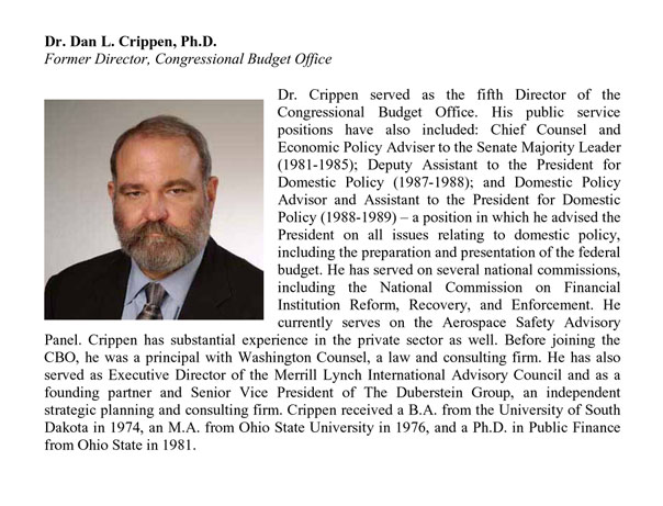
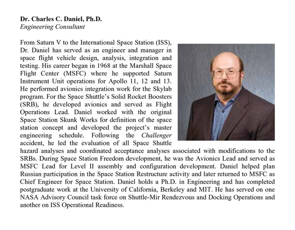
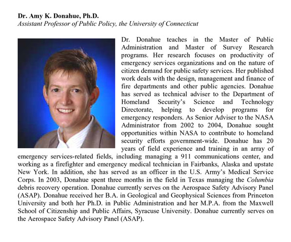
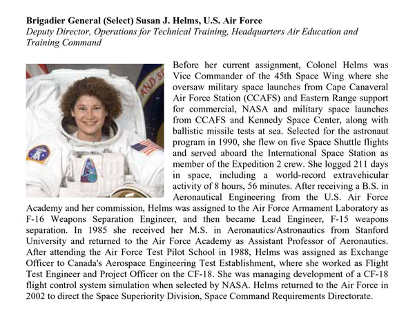
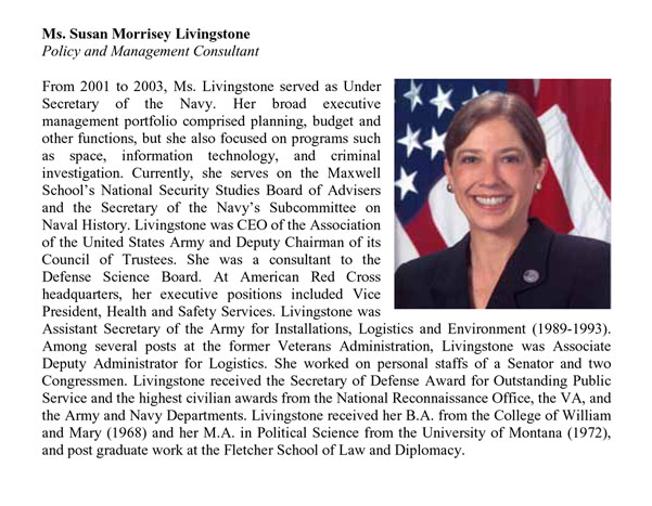
Response to PowerPoint Does Rocket Science
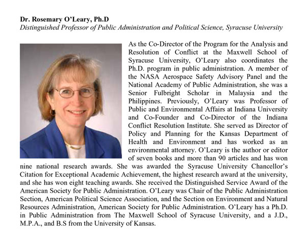
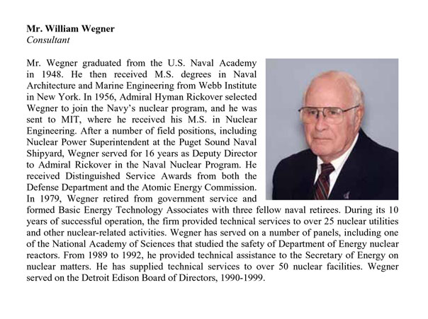
Here are the biographies of those on the Return to Flight Task Group who saw the NASA engineering by PowerPoint and denounced it in their final report (quoted extensively in the last 2 pages of my essay).
As I wrote in the essay above, "Both the Columbia Accident Accident Investigation Board (2003) and the Return to Flight Task Group (2005) were filled with smart experienced people with spectacular credentials. These review boards examined what is probably the best evidence available on PP for technical work: hundreds of PP decks from a high-IQ
government agency thorough practiced in PP. Both review boards concluded that (1) PP is an inappropriate tool for engineering reports, presentations, documentation; and (2) the technical report is superior to PP. Matched up against alternative tools, PowerPoint loses."
The biographies of the PowerPoint reviewers are here:
For an excellent technical report on a complex engineering matter, see the NASA report on
the foam loss from the external tank during the recent launch of the Discover (STS-114).
The report is written in sentences and paragraphs, not bullet-point grunts and slides.
The report presents many extraordinary images of the tank post-launch. The difficult
analytical issue is the lack of comparisons of the tank conditions from the previous 112
launches.
Then go to the link "full report, 2.1 MbPDF".
What a stunningly beautiful piece of work, thank you.
This note needn't be considered for the thread.
Just a couple of clean-up ideas, in addition to "are be...," it may be good to look at:
-- 5 grafs from the very bottom, "In the final report, 7 of Task Group Members... "
-- First graf below the detailed slide analysis, last line: "This is a lot of insecure format... ."
-- The "Marketing Strategy - Good4U" PP slide seems orphaned.
Thank you so much for the close work of your team.
DJ
Many of the contributions to this thread are helpful -- especially those that point out flawed PowerPoint design. Has anyone found an example of skilled information design in a PowerPoint presentation?
I feel that we can only learn so much from examples of what NOT to do...
PP is a competent Projector Operating System for full screen
images and videos, replacing the little forward-back button in
old-fashioned projector systems. PowerPoint is neither the best
nor the worst Projector Operating System. It faces strong
competition from the projector itself with its own forward-back
controls. A Projector Operating System, however, should not
impose Microsoft's cognitive style on our presentations.
PP has some low-end design tools helpful in constructing
PowerPoint parodies.
PP might also help show a few talking points an informal
meetings, but why not instead print out an agenda on a piece of
paper?
PowerPoint may now and then benefit the bottom 10% of all
presenters. PP forces the really inept to have points, some
points, any points.
graphics in his PP presentations. I can't say I've seen anyone else do this and I haven't used Quicktime myself enough to know the buttonology how-to, but he basically puts a very high resolution image into a Quicktime frame that occupies the entire PowerPoint slide. So it's a slide projector. But he can zoom and pan! So he scans in
, whatever, at, say, 3000x2000 and then explores the details of the image while the projected image is always above the resolution threshold of the projector. This is vastly superior to 'mere' projection, despite the LCD projector. And look, it displays on the web!